| Project name | Knowledge Management Module |
| Role | UX Designer / UX Strategist |
| Duration | 2 years |
| Team | Developer Team, UX Researcher, Product Owner |
What does it mean?
I led the UX redesign of the Knowledge Management Module within a global IT Service Management platform, aimed at transitioning to a modern tech stack, updating user flows, and integrating a new design system to meet evolving user needs.
Context
The Knowledge Management Module is a critical component of a global Service Management platform used by companies worldwide. My role as a UX Designer for the past two years has been centered on enhancing the Knowledge Management Module to better serve a wide-ranging user base.
Role
As the UX Designer on this project, I collaborated closely with a dedicated team of developers and a UX researcher. My responsibilities included redesigning user flows, integrating new features, and ensuring the module met the evolving needs of our users.
Challenges
- Complexity: The platform’s long history and interconnected modules posed challenges for iterative transformation.
- Technological Constraints: The old system’s outdated technology and parallel development of the Design System created obstacles.
- Visual Consistency: Mixing new and old components resulted in a suboptimal visual experience.
Goals
To ensure the relevance of the platform, the following business goals were established at the product level:
- Transition to Micro-service Architecture: Move the entire product from the old frontend to a micro-service architecture. This transition aims to improve consistency across the platform and facilitate the renewal of the design system.
- Customer Retention: Enhance customer satisfaction and retention by providing improved or new features that address current user needs and pain points.
Aligned with the overarching business goals, our specific goals for the Knowledge Management Module were:
- Technological Transition: Transition the module to a new technological stack to leverage the benefits of modern architecture.
- User Flow Updates: Redesign and update user flows based on user needs and pain points, incorporating features such as rich text capabilities.
- Design System Integration: Redesign the module’s pages using the new Design System to ensure a cohesive and modern user experience.
- Structure and Permission System: Develop a new structure and permission system to provide fine-grained control over knowledge item visibility and editing rights.
By focusing on these objectives, we aimed to create a more efficient, user-friendly, and technically robust Knowledge Management Module.
Transition the module to a new technological stack and update the user flows of the module based on user needs and pain points while applying the new Design System to the UI.
Metrics
To measure the success of our projects, we established the following key metric:
- Increase the number of users using the new knowledge base by 50%.
Transitioning the technology stack

The frontend is transitioning to a micro-frontend architecture. This shift promises easier and faster UI updates in the future. To achieve this, teams need to recreate all user flows and screens using new components from the design system. In cases where the design system lacks specific components, the teams must develop custom components and solutions according to their need.
New features and user needs
There are several critical feature requests and business needs essential for the Knowledge Base module. Implementing these features requires transitioning to the new tech stack and applying a new architecture in the background. Some of these features mean close collaboration with other domain teams.
Rich Text related features

Providing highly customizable formats for knowledge items is a highly requested feature by customers. This involves replacing read-only parts of the knowledge base. Although the rich text feature is developed by another team, we are responsible for implementing it within our domain.

Permissions system in Knowledge Base

Application managers require a fine-grained permissions system to control which operator and end-user groups can view and edit specific knowledge items. While other modules have a permissions system, it is currently missing from the knowledge base. The new permissions system, developed by another team, will be integrated into our module. We will use a coded prototype to test this new system alongside new concepts for the knowledge base structure.
New structure concepts

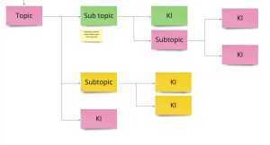
The existing parent-child relationship handling for knowledge items has received complaints from users. To address this, we decided to overhaul the structure along with the permissions system.
I developed two potential concepts to replace the current system, created prototypes, and tested them with application managers. Based on the feedback, I prepared wireframes for the preferred concept that better meets customer needs.
Knowledge Item creation and editing flow updates
Customer requests and our user research indicate a need for an updated creation flow that includes a draft state and different rights for publishing. These updates aim to address various user needs effectively.
Accessibility
Accessibility requirements have become more strict since the previous knowledge base was created. Therefore, each transformed page must adhere to A11y standards. While new components are already compliant, some legacy solutions no longer meet accessibility requirements and need to be updated.
User research

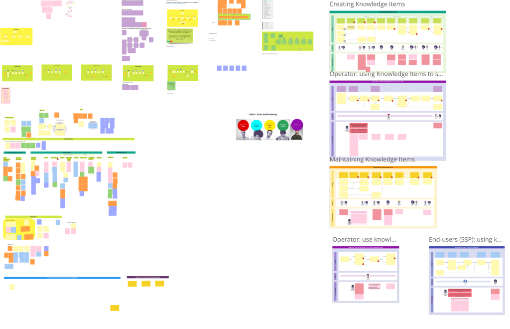
I collaborated with a user researcher and our Product Owner to conduct research. Together, we discussed hypotheses, formulated questions, and our researcher scheduled interviews, in which I participated. When needed, I prepared clickable prototypes for testing during these interviews. We utilized tools like Useberry and Condens for research activities and Miro boards for strategizing.
At the start of the Knowledge Base project, we conducted preliminary research, interviewing customers to create user journeys, identify pain points, and understand needs, alongside another team of UX designers. Over the past two years, we have continuously conducted customer interviews, collected user feedback via forms, and performed Useberry tests. Metrics are constantly reviewed to ensure project success.
User Journeys Identified
- Operators using knowledge items to solve calls
- End users reading knowledge items to solve problems
- Knowledge Editors creating knowledge items
- Knowledge Managers maintaining the knowledge base
Our personas included operators, application managers, and end-users, combined with knowledge management roles, which were developed during preliminary research.
Based on user research, business needs from Product Management, customer input, and technological constraints, we prioritized the following operator-related user journeys:
- Navigating to a knowledge item
- Searching for a knowledge item
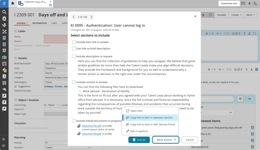
- Using a knowledge item from an incident card
Workflow
For each project, we followed a consistent workflow. Most epics focused on one screen or parts of screens. I regularly checked in with developers and used a dedicated channel to share updates, gather feedback, and understand technological constraints early on.
Release strategy

Given the complexity of the module and user needs, we implemented a switch feature for the new Knowledge Base version. This allows users to opt-in to the new experience and view transitioned pages, while retaining the option to switch back to the old version since the new pages and user flows are not yet feature complete.
Success is measured by the number of users who remain on the new module. Once a certain threshold is reached, we will remove the switch, making the new version the default experience.
While this release strategy currently applies to the Knowledge Base module, I am facilitating an ongoing project to develop a product-wide strategy and UX solution.
Specific Page Designs
Overview
| Page | Description | User Feedback |
|---|---|---|
| Start Page | The first iteration focused on testing the new stack with a less frequently used page. Due to limited components in the design system and the absence of a shared pattern for overview pages, we created our own components. | Significant feedback on white space and displayed information. Reverted to older design logic. Some top-level item features not yet migrated. Plan to update designs once the new structure is finalized. |
| Details Page | This page provides read-only content for operators and includes tabs linking to other modules. We kept these tabs and only updated the knowledge base-related general tab. Introduced a new layout pattern, being the first team to do so. | Mostly positive feedback, especially for the Table of Contents. Some complaints about the layout, prompting further iterations and addition of missing features. |
| Suggestion Widget | Located in another module on the Incident card, this widget offers related Knowledge items for ongoing calls. Initially aimed to redesign through a Design Sprint but focused on transitioning to the new stack with accessibility upgrades. | Feedback highlighted issues with spacing and size changes dictated by the Design System. Iterated on the design to address these constraints. |
| Search Page | Originally planned to use a newly developed “Search” system, but the project was halted. Developed our own frontend solution while using the old search system in the background. Introduced a new layout for displaying search results. | Specific use case from the old module not supported, leading to user feedback. Users generally content with the generic functionality provided. |
Start page
The first iteration focused on testing the new stack with a less frequently used page. Due to limited components in the design system and the absence of a shared pattern for overview pages, we created our own components.

User feedback
We received significant feedback regarding excessive white space and displayed information. In response, we reverted to older design logic. Some top-level item features have not yet been migrated, reducing usability for some customers. I plan to update the designs once the new structure is finalized. For now, this page serves as a starting point for searching or browsing within the Knowledge Base module.
Details page

This page provides read-only content for operators and includes tabs linking to other modules. We kept these tabs and only updated the knowledge base-related general tab. We introduced a new layout pattern, being the first team in the company to do so.
User feedback
Feedback was mostly positive, especially regarding the Table of Contents. However, the layout received some complaints, prompting further iterations and gradual addition of missing features.
Suggestion widget

As this is a component created fully by our team, I created the UI elements based on similar patterns of the Design System team.
Located in another module on the Incident card, this widget offers related Knowledge items for ongoing calls. Initially, we aimed to redesign this user flow through a Design Sprint, but changing priorities led us to focus on transitioning the component to the new stack, with accessibility upgrades and minor convenience features. The UI elements were created following patterns from the Design System team. features.
User feedback
Feedback highlighted issues with spacing and size changes dictated by the Design System. We iterated on the design to address these constraints.
Search page

Originally, we planned to use a newly developed “Search” system, but the project was halted. Consequently, we developed our own frontend solution while using the old search system in the background. A new layout was introduced for displaying search results.
User feedback
A specific use case from the old module is not supported by the new page, leading to user feedback. However, users are generally content with the generic functionality provided.
Difficulties
The product is a complex platform with features built over decades, and long-term users have adapted to its quirks and missing functionalities. The interconnected modules, which share data and display parts of different cards, complicate iterative transformation and separation.
To address this, I initiated cross-cutting projects for consistency in certain use cases. The old system’s outdated technology imposes significant constraints on the development team until the navigation framework is fully updated.
The parallel development of the Design System, which started slightly before our project, often leads to inconsistencies as new and old components must be mixed, resulting in a suboptimal visual experience.
Learnings
- User Preferences: Users desire the new visually improved UI but have concerns about spacing and white space.
- Accessibility: I gained significant insights into accessibility, noting that common internet patterns often fail to comply.
- Team Collaboration: Our team’s collaboration improved as we experimented with integrating design into the agile workflow.
- Scoping and Priorities: Managing many requirements required me to work closely with the Product Owner. We regularly reviewed the project’s status, user feedback, and overall product goals to stay aligned.
- Iterative Approach: Starting small allowed us to learn from initial iterations, which was crucial for such a large project that couldn’t be fully designed upfront.
- Adapting to Changes: High-fidelity designs quickly became obsolete as the Design System evolved, requiring close alignment of UX/UI design with implementation.
Conclusion
The project was still ongoing, when I’d created the case study, with significant progress made in transitioning to the new tech stack and integrating user-centered design improvements. Continuous user research, iterative design, and addressing technological constraints are key focus areas as we move towards completing the project.